‘Empty space has more energy than everything we know.’
This statement relates to quantum physics, more precisely to all matter in the observable universe. But, I would argue this hypothesis applies to other fields of human interest too, like Interface Design.
The role of white space
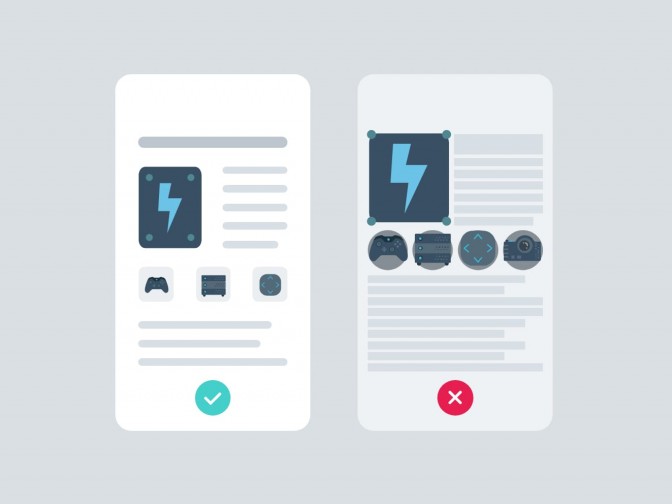
White space in design is often called negative space or empty space. It’s simply the unmarked area in the design. But to be super precise, this space is not completely empty, there might be colour, pattern, texture or even a background image. When used in the right way, it decreases necessary cognitive load to absorb and understand information, makes content easily scannable and improves legibility. It brings various visual clarity when used in different proportions. It declutters surfaces and overall improves the users’ experience. Thus, globally increasing the effectiveness of an app or a page, which in turn brings new engagement.
Designers love it, stakeholders want to fill it
It’s pretty understandable that many clients, managers as well as developers consider white space as a wasted or unnecessary space just waiting to be filled. As always there is a golden ratio, but it varies in different cases and contexts. That’s why I’d call it a general outline rather than a fixed set of rules:
1. Legibility First
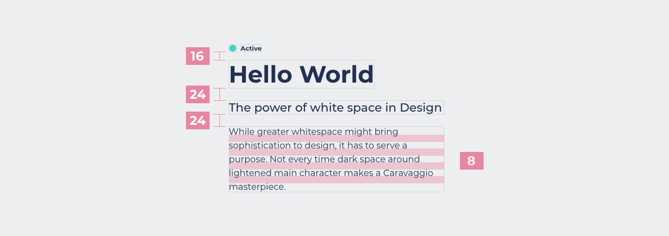
When laying groundwork for an optimal design system, one has to take into account spaces between lines, paragraphs, menu items (so called micro spaces in general), to match with amount of content to be consumed by the user.


In other words, planning the right amount of space and positioning of the UI components, while making everything readable and friendly on the eye. What value comes from great content that cannot be read or makes users’ eyes tired? That’s why – readability first.
2. Validate the purpose of white space
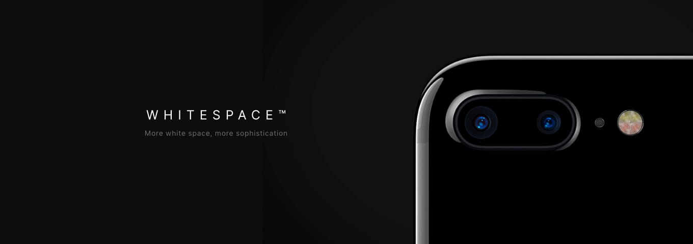
While greater white space might bring sophistication to design, it has to serve a purpose. Not every dark space around lightened main characters makes a Caravaggio masterpiece.

Unnecessary big white space in between layout sections (so called macro spaces) can make navigation harder for user or may be harnessing app and page scrollability. So, in other words, it’s more of an optimisation process and case by case approach, rather than setting a fixed aspect ratio.
3. Breathability may bring more conversion
Designers main job is to bring out the effectiveness and value of the white space to clients and managers. Users not overwhelmed by information, are more likely to positively digest content, yet more likely to click the almighty CTA.

Although, simultaneously with more white space, comes more responsibility for designers. With more breathing space, aiming for effective structure of content per fold, means finding more creative ways to develop the right UI components that will cover up all necessary content, while maintaining good global user experience.
Main takeaways
- Once mastered, white space in certain cases may become more powerful than the sleekest UI component.
- By giving the UI elements more space wisely, designers contribute to better user experience.
- Adding more breathing space in the UI and relaxing the overall interaction of the user’s experience is an additional value that finally leads to better business.


