It is relatively easy to design for ideal scenarios where people use devices and systems as intended and everything goes well. The real challenge comes when users get into trouble.
Errors happen. This is a fact we have to embrace, and it is our responsibility to design products and services that prevent and handle problems in the best possible way to create a delightful experience for the user, free from stress and frustration.
Design for the system
Network, server or implementation problems cause errors we cover for all projects.
We always keep these simple, explain the issue (and when possible, some advice on how to avoid it in future) using human language and offer an exit so users are not stuck.

Design for user actions
Donald A. Norman divides errors caused by users’ actions in two types: Slips and Mistakes.
Slips happen unconsciously, when user is on autopilot and not paying attention to the task. They are easy to detect because they occur when users intend to perform an action, but end up doing something else.
Mistakes, on the other hand, are a result of a conscious decision.
Users, often due to a misunderstanding or lack of information, develop mental models (how they think they can achieve a goal) that don’t match how the interface works. Mistakes are hard to detect. User might follow the right steps to complete their goal, but, because that goal is wrong, they will end in an error. E.g. If I misunderstand one of the warning lights in my car, I can successfully fill in the oil container without realising the problem is the cooling fluid.
There are a few tips that help us to prevent as many slips and mistakes as possible when designing:
- Simple interfaces help to make mis-clicks and mis-taps a lot less likely.
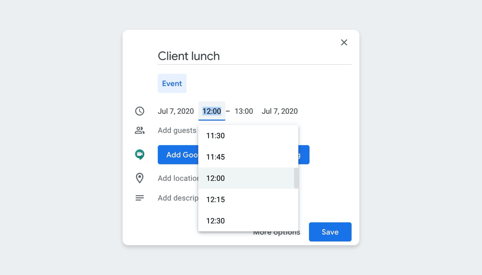
- Constraints & Preventative UI, like not being able to select a past date in a date picker; or showing a Caps Lock icon in a password field.
- Suggestions save users time and effort, and avoid mistypes.

- Remove memory burden. Users get distracted, don’t always read what’s on the screen and; if they do, might not remember it. It’s important to give them context and prevent them from making mistakes without interrupting the workflow. If a user goes away from the application and comes back, they must know what are the previous steps they completed.
Good Defaults & Formatting save users the hassle of selecting all the relevant choices and sometimes even help them better understand the question.
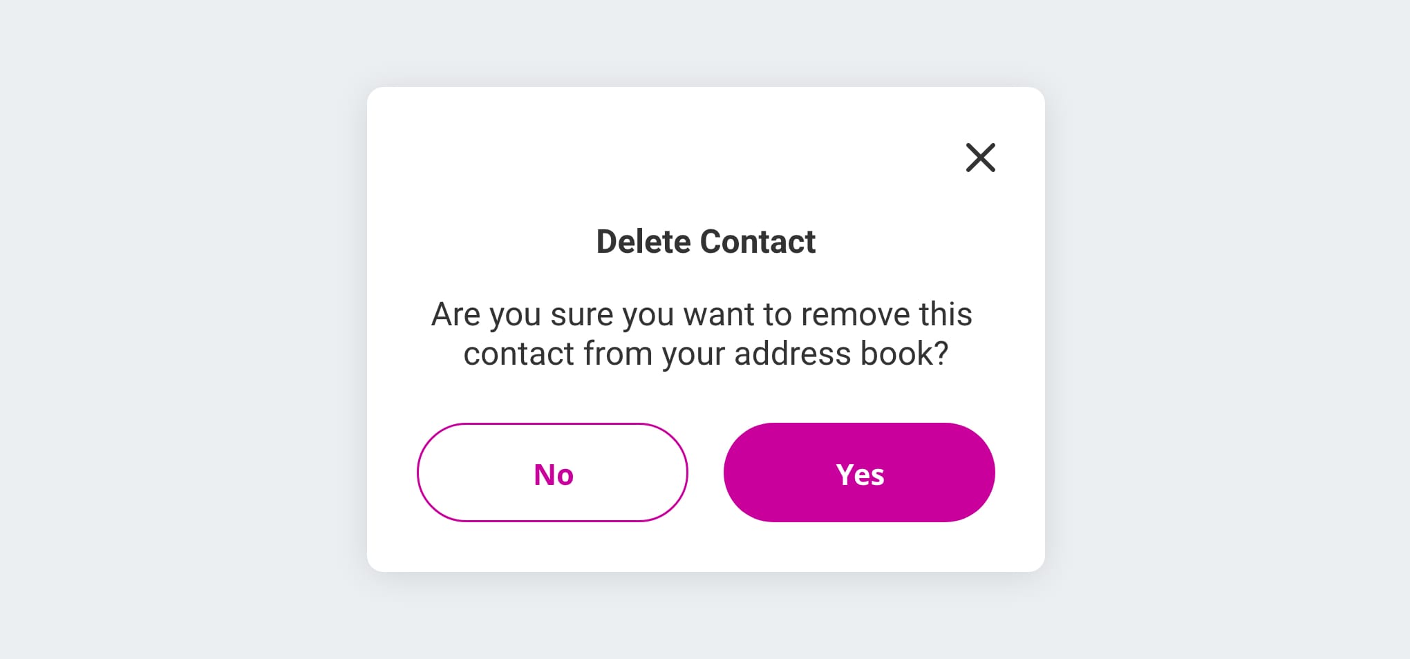
- Confirmation Dialogues are particularly important when user is destroying something. It is not enough to ask “Are you sure you want to do this?”. Explain what this is, in easy to understand language. This way we make sure the user really meant to delete something that took time and effort to create.
- Escape Plan. We all can relate to that horrifying moment when you close a file without saving it, change something by mistake or send an email without that attachment. Users must have a chance to backtrack and get things right. A simple ‘undo’ helps users to feel more confident because it means mistakes are low cost and can be easily fixed.

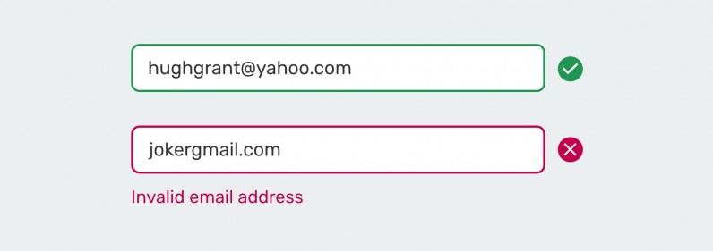
- Feedback that is visible and understandable is essential for users to know if they have succeeded or failed at performing a task. Something as simple as contextual error warning can save time and frustration.
Design for edge cases
- Use real data in prototypes to avoid beautiful designs to be broken in production.
- If the interface is going to be available in multiple languages, check them. The same word can be 5 to 21 characters long.
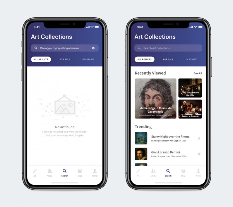
- Design for extremes, from blank to maximum states. What happens when users haven’t interacted with the system yet, the memory of their device is full, or they attach a file that exceeds the size?
Conclusion
We know errors happen, so let’s keep this in mind while designing so we can provide users with smooth experiences that don’t add stress to their already busy lives.


